


Table of contents
- Creating a Simple Dark-Ready Design System
- My View* on Vue: A Pleasant Surprise - A React Dev's Perspective
- Building With Vue: Implementing the design system, components, and Dark Mode
- Learn from my struggles 🙃: Importing images into components from src/assets rather than /public
- The End of My Vue-tiful *Journey: Lessons Learned from Kiaret
Greetings once more! Imagine this: two birds, one stone. That's what I accomplished recently:
Crafting a sleek one-page website for a health insurance company, Kiaret.
Taking my first strides into the world of Vue.
Now, the first task was a bit like setting sail with a treasure map that had only two clues: the company’s name and the company’s objectives. As for the second mission, it was part of my grand attempt to shift from being a Senior Product Designer to a fledgling Front End Developer. Since I'd already danced with React in a previous project, I figured I should also groove with Vue. It was like trying to learn a new strategy while trying to speed-run a new game.
This blog is your backstage pass to the creation of that one-page wonder – a website complete with dark mode and a basket full of reusable UI components. Let's dive into this intriguing journey!
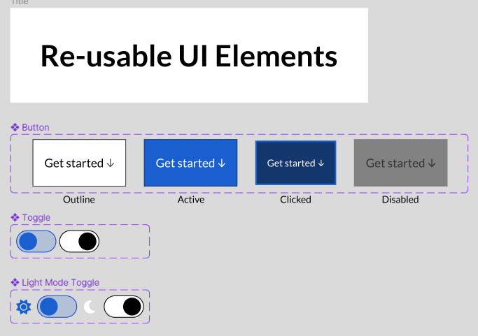
Creating a Simple Dark-Ready Design System
Creating the design system was an exciting journey that helped me address critical questions about fonts, elements, and assets. You can explore the design system's wild ride in this Figma file.
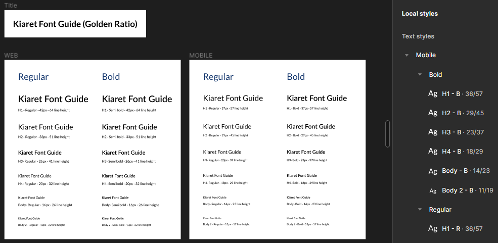
I hopped on board the Golden Ratio train to create a font guide tailored for both web and mobile systems. This involved making decisions about font sizes, weights, and line heights to elevate typography and readability. Implementing these font guides gave me a newfound appreciation for the frontend devs I've collaborated with in the past 😅.
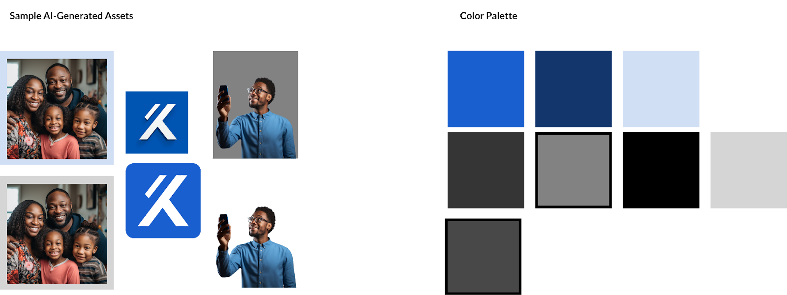
I embarked on a colourful journey to craft a palette, enlisting the help of AI tools like Midjourney and Microsoft Designer (yes, I called upon our AI overlords 🤖). Together, we quickly conjured up the business logo (loosely inspired by the Lambda symbol and a touch of Half-Life) and some human imagery for the application. The colour palette was carefully chosen to maintain brand identity while ensuring contrast in both light and dark modes.
I put a bow on the design system by crafting reusable UI components that would come in handy during implementation. My focus here was on creating versatile buttons and toggles that would seamlessly switch between dark and light modes.
My View* on Vue: A Pleasant Surprise - A React Dev's Perspective
*😉 Pun Intended
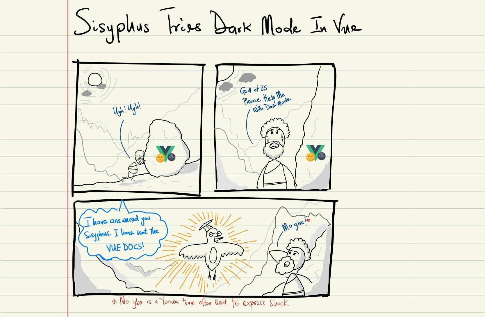
As I mentioned earlier, my decision to use Vue in this project was born out of seeing it in a lot of Front-End developer postings 🙈. So I went ahead and dived into the official docs and boy oh boy was I pleasantly surprised.
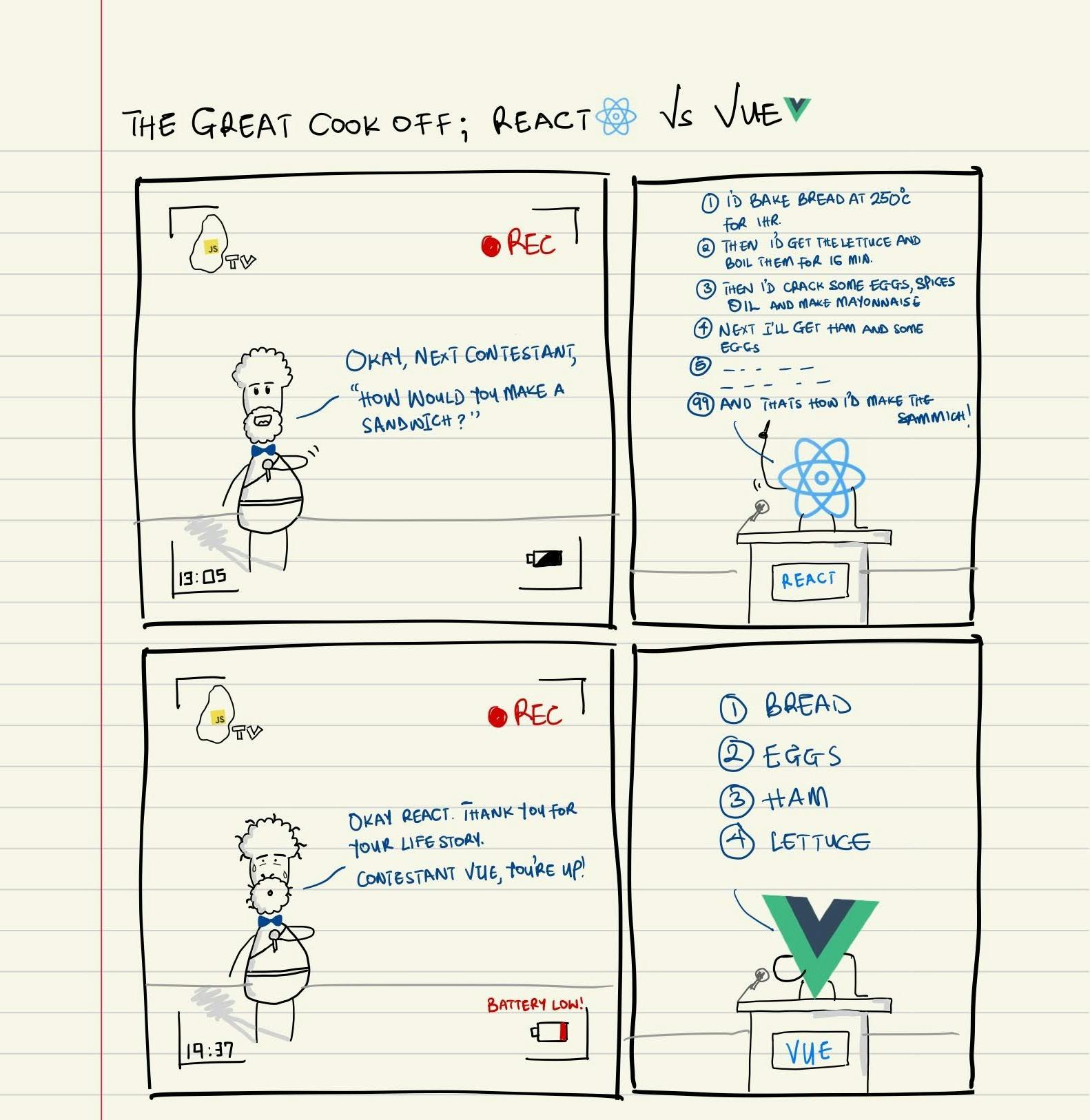
As the comic above illustrates, Vue is so refreshingly declarative. After learning Vanilla JS, I picked up React and started learning about lifecycles, hooks, and JSX. It was only after creating HxSkits did I understand the power React’s imperative granularity presented.
Nonetheless, it was surprisingly refreshing to discover how Vue tackled reactivity with its ref() and reactive() methods, managed dependencies through the computed and watch methods, and, most notably, offered built-in directives and a user event handling syntax. I also couldn't help but be impressed by Vue's compositional API. Perhaps it's my aspirational desire to weave intricate code talking, but Vue's compositional API not only helped me maintain code organization but also strangely improved my clarity of thought. It made it easy to distinguish where the code ended and the templating began.
I was initially worried about the syntax differences when learning the framework, but everything seemed like a “more to-the-point” version of React. Safe to say for less complex projects, I’ll be keeping Vue in view (Yes I know, I'm using the dad joke again, come fight me 🥷🏾).
Building With Vue: Implementing the design system, components, and Dark Mode
Given the small size of this project, my first decision was to use Pinia to handle global state management over VueX. This was because Pinia’s independent stores were simple enough to store, modify, and share key states across the application without the need to lug a single state tree from module to module (Man, I can't wait for Vue 5’s switch to Pinia). Apart from Pinia, I also went with TailwindCSS for styling.
So, let's dive into the code! First up, I grappled with font styling. But before I spill the beans, let's take a moment to salute all the Frontend devs I've pestered in my past life as a UX/UI designer. You folks are the real MVPs 🥹.
Now, when it comes to font styling – line heights, font sizes, and all that jazz – it's all about making the text more readable. Ensuring a responsive font size that still followed the design was a little bit of a doozy, but rem spacing came in clutch at the end of the day. Setting the root font size as 16px, I was able to set dynamic font for smaller breakpoints changing the root font size.
@tailwind base;

/***************************
    WEB FONT STYLES
***************************/
@layer base {
    .body2 {
        font-size: 0.8125rem;
        line-height: 1.375rem;
    }

    .body{
        font-size: 1rem; /** Equivalent to 1 x 16 = 16*/
        line-height:1.625rem;
    }
}

/***************************
    TRADITIONAL MOBILE FONT STYLES
***************************/
@layer base {
    @media (max-width: 640px) {
        .body2 {
            font-size: 0.6875rem;
            line-height: 1.3571428571rem;
        }

        .body {
            font-size:0.875rem; /** Equivalent to 0.875 x 16 = 14*/
            line-height: 1.4375rem;
        }
}
I moved on to creating my first component; the Navbar. Apart from being the first visual element at the top of the page, this element also allowed me to work on 3 things;
The Dark Mode & Menu Overlay Stores: The Dark Mode store is like the mission control centre for toggling dark mode on and off. It's equipped with a nifty method to set or toggle the dark mode. Then there's the Menu store, the brain behind opening and closing the menu. It has a method to toggle the menu's visibility.
 //Taken from DarkModeStore.ts
 export const useDarkModeStore = defineStore('darkModeStore', (): darkModeStoreInterface => {
     const isDarkModeEnabled = ref(false)
     const toggleDarkMode = (toggleOption?: boolean) => {
         if (toggleOption === true || toggleOption === false) {
             isDarkModeEnabled.value = toggleOption
         } else {
             isDarkModeEnabled.value = !isDarkModeEnabled.value
         }
     }
     return { isDarkModeEnabled, toggleDarkMode }
 })

 //Taken from MenuVisibilityStore.ts
 export const useMenuVisibilityStore = defineStore('menuVisibilityStore',
     (): menuVisibilityInterface => {
         const isMenuVisible = ref(false);

         const toggleMenu = () => {
             isMenuVisible.value = !isMenuVisible.value
         }

         return { isMenuVisible, toggleMenu }
     })
The Toggle widget: This little gem is like a swanky checkbox, all dressed up. It's bound to the ‘isDarkModeEnabled’ property from the useDarkModeStore. Clicking it toggles dark mode with finesse. I even threw in some custom CSS to make the button dance when it's clicked. I reused this widget in the menu overlay, making it a breeze for mobile users to switch to dark mode.
 const { isDarkModeEnabled } = storeToRefs(useDarkModeStore())
 const { toggleDarkMode } = useDarkModeStore()

 const assetsToBeUsed = computed(() => {
     return {
         logoSrc: isDarkModeEnabled.value ? whiteMoon : blueSun,
         title: "Toggle"
     }
 })

 </script>

 <template>
     <div class="relative">
         <label class="relative" @click="() => { toggleDarkMode() }" for="toggle">
             <div class="m-0 p-0 flex relative cursor-pointer">
                 <img :title="assetsToBeUsed.title" class="w-5 mr-2" :src="assetsToBeUsed.logoSrc" />
                 <input v-model="isDarkModeEnabled" name="toggle" class="sr-only" type="checkbox" />
                 <div class="dot transition absolute
                 w-4 h-4
                 top-1 left-8 sm:w-6 sm:h-6 bg-blue rounded-full "></div>
                 <div class="dot-bg w-10 h-6
             sm:w-14 sm:h-8
             bg-light-blue rounded-full border border-blue"></div>
             </div>
         </label>
     </div>
 </template>
/**************** TOGGLE STYLING ****************/ input:checked ~ .dot { transform: translateX(100%); background-color:black; } input:checked ~ .dot-bg { background-color: white; border: 1px solid black; }
Menu Overlay: The menu button (essentially a styled hamburger icon) simply toggles the Menu overlay store when clicked.

With the Navbar, dark mode store and its toggle methods being completed, I still needed to effect CSS changes based on when the ‘isDarkModeEnabled’ was either true or false. This is where the dark mode variant of TailwindCSS comes in! Using Vue’s Watch method, I could easily apply the dark to the body of the HTML document depending on whether the dark mode reference was truthy or falsy.
//Taken from App.vue

//Toggle Tailwind's Dark Mode when Pinia's dark mode state is set to True
watch(isDarkModeEnabled, () => {
  toggleTailwindDarkClassToBody()
})
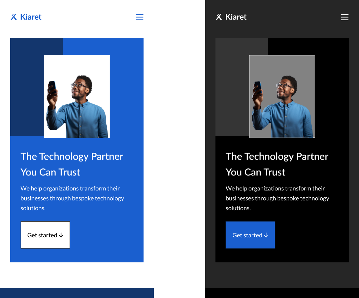
This is especially handy because it lets different sections (which I crafted as components) join the dark mode party. They can tweak background images, text colours, and colour schemes. Take the hero section, for instance, transforming from light mode to dark mode like a superstar 🕺🏾.

<script setup lang="ts">

//Vue imports
import { computed } from 'vue';

//Pinia store
import { useDarkModeStore } from '../../store/DarkModeStore';

//Pinia methods
import { storeToRefs } from 'pinia'

//Components
import Buttons from '../common/Buttons.vue';

//Utility
import { scrollToSection } from '../../utilities/scrollIntoView';

//Imags
import darkManHeroImage from "../../assets/man-image-dark.png"
import whiteManHeroImage from "../../assets/man-image-light.png"

const { isDarkModeEnabled } = storeToRefs(useDarkModeStore())

const dynamicProperties = computed(() => {
    return (
        {
            webBackgroundImage: isDarkModeEnabled.value ? "bg-web-hero-image-dark" : "bg-web-hero-image-blue",
            mobileBackgroundImage: isDarkModeEnabled.value ? "bg-mobile-hero-image-dark" : "bg-mobile-hero-image-blue",
            backgroundImageBorder: isDarkModeEnabled.value ? "border-gray" : "border-navy",
            manHeroImage: isDarkModeEnabled.value ? darkManHeroImage : whiteManHeroImage,
        }
    )
})

</script>

<template>
    <section id="hero-section" class="constrained-container
    flex
    py-10 lg:py-16
    h-full 2xl:max-w-7xl 2xl:mx-auto">
        <div id="hero-section-internal-div"
            :class="`dark w-full
                border-2 ${dynamicProperties.backgroundImageBorder}
                                                        m-0 p-0
                                                        px-6 sm:px-17
                                                        h-[calc(100vh-6.6875rem)] lg:h-[calc(100vh-8rem)]
                                                        flex
                                                        bg-mobile-hero-image-blue dark:bg-mobile-hero-image-dark xl:bg-web-hero-image-blue xl:dark:bg-web-hero-image-dark bg-no-repeat bg-cover`">

            <div class="flex items-center">
                <div id="hero-section-contents" class="flex flex-col-reverse sm:flex-col-reverse lg:flex-row lg:items-center">
                    <div class="flex flex-col">
                        <h1 id="header-text" class="h3 sm:h1 text-white font-semibold sm:pt-0">The Technology
                            Partner <br id="hero-section-line-break" class="hidden sm:block"> You Can Trust</h1>
                        <h4 id="hero-supportingText" class="body sm:h4 text-white w-full sm:w-4/5 pt-4">We help organizations transform their
                            businesses through bespoke technology solutions.</h4>
                        <div @click="()=>{scrollToSection('mission-section')}" class="pt-5">
                            <Buttons :buttonClassType="`${isDarkModeEnabled ? 'base' : 'outline'}`" buttonId="heroCTA" buttonText="Get started" iconType="arrowDown" />
                        </div>
                    </div>
                    <div class="pb-4 sm:pb-8 xl:p-0">
                        <img id="hero-image" :src="`${dynamicProperties.manHeroImage}`" class="transition delay-300 ease-in-out
                            w-48 sm:w-80 lg:w-96" alt="" srcset="">
                    </div>

                </div>

            </div>

        </div>
    </section>
</template>
The last part of implementing dark mode was to use Javascript to automatically detect the user’s theme preference and set the 'isDarkModeEnabled' flag to match.
//Taken from checkLocalDarkModeSetting.ts
export function checkLocalDarkModeSetting() {
    if (window.matchMedia && window.matchMedia('(prefers-color-scheme:dark)').media) {
        return true
    } else {
        return false
    }
}

//Taken from App.vue
//Check Platform's local dark mode to and set Pinia dark mode to match
if (checkLocalDarkModeSetting()) {
  toggleDarkMode(true)
  toggleTailwindDarkClassToBody()
}
Learn from my struggles 🙃: Importing images into components from src/assets rather than /public
While navigating the winding roads of this project, I had an 'aha' moment about asset storage – the distinction between housing them in the /public folder and sourcing them from the src/assets folder.
The key takeaway? Using assets from the /public directory in Vue components is like taking a shortcut that skips vital processes (think optimization and hashing) performed by Webpack. An example of this optimization is Webpack hashing an image in the src/assets folder and being able to cache this image after it is first displayed, preventing unnecessary network requests.
But wait, there's more 👻🔪. If you opt for URL paths to assets in the src folder without importing them as JavaScript objects, Webpack steps in with its own brand of magic. During the project build, Webpack sprinkles some hash fairy dust on the images in the src/assets folder and adds a unique signature to their filenames. The result? Image elements with broken paths. Don't fret, though – the solution is as easy as pie: import those images as objects, and you're good to go.
//Taken from HealthInsuranceSection.vue
//Images
import familyImageBlack from "../../assets/family-image-black.png"
import familyImageBlue from "../../assets/family-image-white.png"

const pathToFamilyImage = computed(() => {
    return isDarkModeEnabled.value ? familyImageBlack : familyImageBlue
})
Now, before you kick the /public folder to the curb, let me be clear. It's not off-limits for images; they can still find a cozy spot there, as long as they're not used in JS modules. For example, I housed background images in the /public folder to create custom background classes in my tailwind.config.js file.
//Taken from Tailwind.config.js
const defaultTheme = require('tailwindcss/defaultTheme')

export default {
  darkMode: "class",
  content: [
    "./index.html",
    "./src/**/*.{vue,js,ts,jsx,tsx}",
  ],
  theme: {
    extend: {
      colors: {
      backgroundImage: {
        'mobile-hero-image-blue': "url('/mobile-hero-image-blue.png')",
        'mobile-hero-image-dark': "url('/mobile-hero-image-dark.png')",
        'web-hero-image-blue': "url('/web-hero-image-blue.png')",
        'web-hero-image-dark': "url('/web-hero-image-dark.png')",
        'contact-us-image-blue': "url('/contact-us-bg-blue.png')",
        'contact-us-image-dark': "url('/contact-us-bg-black.png')",
        'footer-bg-blue': "url('/footer-bg-blue.png')",
        'footer-bg-black': "url('/footer-bg-black.png')",
        'footer-bg-blue-mobile': "url('/footer-bg-blue-mobile.png')",
        'footer-bg-black-mobile': "url('/footer-bg-black-mobile.png')",
      }
    },
  },
  variants: {
    extend: {
      backgroundImage: ['responsive']
    }
  },
  plugins: [],
}
The End of My Vue-tiful *Journey: Lessons Learned from Kiaret
*3rd time I'm using the same Vue-dad joke, fight me 🥷🏾
In this blog post, I shared my experience of creating a one-page website for Kiaret, a health insurance company, using Vue and TailwindCSS.
Creating a simple dark-ready design system using AI tools and the golden ratio.
Learning Vue and its compositional API, made me appreciate its declarative and reactive nature
Building with Vue and implementing dark mode using Pinia and TailwindCSS.
Using Vue components to create modular and reusable UI elements.
This project was a great opportunity for me to showcase my skills as a junior front-end engineer and to learn new technologies and techniques. I enjoyed the challenge and the creativity involved in this project, and I am looking forward to more web development opportunities in the future.
Thank you for reading my blog post. I hope you found it informative and entertaining. In my next post, I will share my progress on a big project that I am planning to do soon (Hint: It involves Whatsapp). This time, I will be doing UX research before I start coding, unlike my previous project where I ended up building for myself 🙃. Stay tuned for more updates and insights from my web development journey. See you soon! 😊